WildTroutStreams.com: The Next Generation

Hey PCCray... Can you get it for Android?

Well, the short answer is, if the screen is big enough it should already work on current versions of Android. Try FireFox for Android if Chrome or the standard browser doesn't work

The long answer is:

1) Really designed for use on a big screen. Makes no sense on a phone even though it actually runs on an iPhone (though the legends take up the entire screen). A large tablet with a super hi rez screen might be OK.

2) Unless you have an unlimited data plan, you really don't want to use it without WiFi. This map is a data hog and you'll burn a limited data plan mucho fasto.
 
Site is really good for stream exploration. I will usually look at multiple websites before heading out there. This covers most of the issues - state lists, public land, topo map, road access, etc.

There are still a few things I would still use from other sites, just "blue sky" thinking in case one or two can be added:

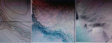
1) the lidar/hillshade layer from pasda... these 'digital elevation maps,' made with lasers shot from planes (!), are great for finding small grades or logging roads. can find old grades not on any map.

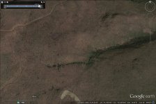
2) a high detail, leaf-off satellite image. these can sometimes show roads and trails, stream width, and even suggest rhodo/ no rhodo status on stream once you get used to it. can usually get one using the clock symbol on top tool bar of google earth (see below). is there a good state wide one w/o doing that? I dunno.
https://support.google.com/earth/answer/148094?hl=en

3) a detailed bedrock geology layer. now on dcnr mapping or available as google earth layers ('kml's). ok, not everyone uses this. but we all know about limestone reducing acidity so increasing fertility. similarly, a mountain stream starting in Juniata, Huntley or Catskill bedrock is less likely to be 'acid rained' into fish-free status than one starting in Burgoon, Pocono, or Tuscarora bedrock.

thanks for great site, and again these are just blue sky ideas, probably not used by everyone! the wts site is a major time saver as is.

ps here's an example leaf-off image of upper wolf swamp run... starts in the clear but gets rhodo-ed as you go downstream... image with leaves on wont show this...
 

Attachments

  • wsw.jpg
    wsw.jpg
    120.1 KB · Views: 3
...leaf-off satellite image is good for rhodo, some trails, and stream width...

but lidar can be better for old logging roads. USGS topo and leaf-off satellite don't show old grade on north side of this ravine, but etched line in lidar does...
 

Attachments

  • 16566334673_b9bf36d172_c.jpg
    16566334673_b9bf36d172_c.jpg
    86.1 KB · Views: 2
Hey k-bob, thanks for the suggestions.

I actually spent several hours trying to get the LIDAR base layer on the map. Unfortunately, it comes off of a different kind of server from the other base-layers (WMTS, if memory serves) and Leaflet support for this layer isn't very good, and depends on a 3rd party plugin. My initial attempts at integrating weren't successful. It's something I intend to circle back to at some point but it's now a fairly low priority on a growing list.

Similar trouble with the leafs off image layer. This map is based on leaflet.js with mapbox.js extensions. I don't think I can access the Google image layers you're referencing using those APIs. There may be an OpenLayers plugin that provides an interface, but that's another complication I don't want to deal with at this time.

My priorities right now are to:

1) Improve printing (basically the only way to print a map is to do a screen capture first then print the image).

2) Provide tools so you can drop down markers, drag and label them, and then, export to a .csv or .kml file

3) export a world image file that you could load seamlessly into Avenza PDF and use it on your smart phone as a wilderness GPS

Once I get those things done, I might circle back to your fantasy list.

I am a self-taught JavaScript programmer, so if there's anyone out there who is a JavasScript guru and would like to work with me on any of this, I'd welcome the help.
 
I just wish I knew what you're talking about. All I know about Java is that I have to update it periodically. lol I love the new system though, you did a great job. At least I know how to use it for my simple needs.
 
Some other ideas;
1) Getting the names to display is kind of glitchy. You have to get the pointer at EXACTLY the right place to get the name to display.

2) Using 3 shades of purple for the biomass classes is not ideal. The colors are too close together.

Here is some good info on color gradients on maps. This is from Cindy Brewer at Penn State, who has a world-wide reputation in the use of color in maps:

http://colorbrewer2.org/

In the upper left, you can see some good choices for color gradients.

The colors should have these two qualities:

1) They should be very easy to tell apart.

2) The colors should indicate a gradient, a progression from high to low.

 
wts thanks I think the site is great, and it saves a lot of time. I feel lucky to be able to fish with so much info!
 
troutbert wrote:
Some other ideas;
1) Getting the names to display is kind of glitchy. You have to get the pointer at EXACTLY the right place to get the name to display.

Troutbert, I agree it's annoying. I have no control over that (it's a function of how the libraries I'm using work). I have noticed that performance varies a bit by browser: for example, it seems to work more smoothly on my Mac using Safari rather than Firefox. You may want to try a few different browsers including Chrome and (if on Windows) IE 10 or IE 11. Let us know what you find out.

2) Using 3 shades of purple for the biomass classes is not ideal. The colors are too close together.

Here is some good info on color gradients on maps. This is from Cindy Brewer at Penn State, who has a world-wide reputation in the use of color in maps:

http://colorbrewer2.org/

In the upper left, you can see some good choices for color gradients.

The colors should have these two qualities:

1) They should be very easy to tell apart.

2) The colors should indicate a gradient, a progression from high to low.

The tool is only as good as the carpenter, apparently, as I selected the current color scheme using colorbrewer2. It was a conscious decision on my part to keep the bottom three categories in the purples, in part because there's almost no C and D streams known, so I felt it OK to lump them all together without a great deal to differentiate them. I thought it most important to distinguish A's from B's from the rest of the world, and the color scheme accomplishes that.
 
A conscious choice, and it is probably a good one.

Speaking personally, I have a database of a few select counties that lists lots of C's and D's, and most streams that are not A have sections of B, C, and D. Your map doesn't appear to have nearly as many "sections" per stream.

I suspect your database from the PFBC just isn't that detailed to keep it smaller, as for regulation purposes there is only "A", "has fish but not A", and "doesn't have fish". i.e. most of those streams I'm talking about are listed as "unknown" on your map, in reality those are all a mix of B, C, and D's, often all 3 in different sections of the same stream.

Comparing to personal experience, the divide I care most about is C to D. Meaning I tend to avoid A's due to crowds (excepting some smaller, less popular ones), target B's and C's as they usually fish as well or better than A's, and I avoid D's as they usually don't fish well.

Anyway, I recognize I'm not in the majority. This is still a pretty good leap forward, and thanks for it. Carry on.
 
wtsobsessed wrote:
troutbert wrote:
Some other ideas;
1) Getting the names to display is kind of glitchy. You have to get the pointer at EXACTLY the right place to get the name to display.

Troutbert, I agree it's annoying. I have no control over that (it's a function of how the libraries I'm using work). I have noticed that performance varies a bit by browser: for example, it seems to work more smoothly on my Mac using Safari rather than Firefox. You may want to try a few different browsers including Chrome and (if on Windows) IE 10 or IE 11. Let us know what you find out.

2) Using 3 shades of purple for the biomass classes is not ideal. The colors are too close together.

Here is some good info on color gradients on maps. This is from Cindy Brewer at Penn State, who has a world-wide reputation in the use of color in maps:

http://colorbrewer2.org/

In the upper left, you can see some good choices for color gradients.

The colors should have these two qualities:

1) They should be very easy to tell apart.

2) The colors should indicate a gradient, a progression from high to low.

The tool is only as good as the carpenter, apparently, as I selected the current color scheme using colorbrewer2. It was a conscious decision on my part to keep the bottom three categories in the purples, in part because there's almost no C and D streams known, so I felt it OK to lump them all together without a great deal to differentiate them. I thought it most important to distinguish A's from B's from the rest of the world, and the color scheme accomplishes that.

You might simplify it into two classes: A and B-D, and just use two colors.

 
We just updated the site with some major new functionality. See my new thread on the subject!
 
Back
Top