T
Troutmeister
Active member
- Joined
- Jul 9, 2018
- Messages
- 157
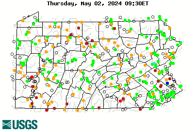
I was looking for some info on stream flows this morning. Streams that came up with cfs measurements before now come up and instantly switch to some other page with only the gate height showing. Gate height means nothing to me. Anybody else notice this? Is there some tab or something I'm missing to get back to the original page with cfs and in many cases temperature?